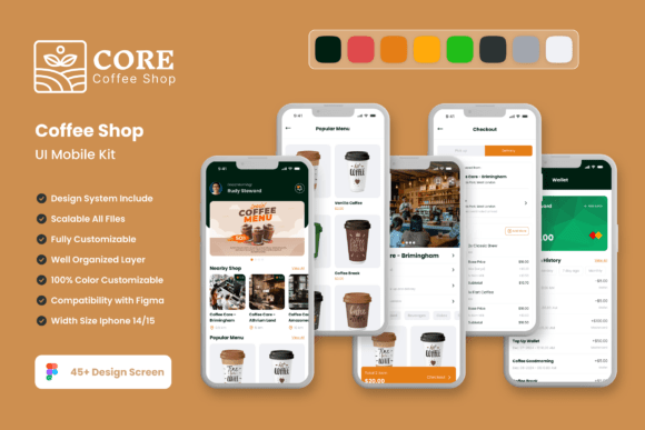
Build a Better Coffee Shop App with This UI Kit
Launching a mobile app for your coffee shop can feel like a monumental task, especially when you're starting from a blank canvas. The pressure to create something that is both beautiful and functional, while also capturing the unique essence of your brand, is real. This is where a well-crafted design template can transform your workflow, moving you from an idea to a polished prototype in a fraction of the time. The Core Coffe Shop App Mobile UI Kit is designed precisely for this purpose, offering a comprehensive toolkit for designers and business owners alike.
At its core, this kit provides 45 meticulously designed, pixel-perfect screen templates that cover the essential flows of a coffee shop application. Think about the journey your customer takes: browsing a visually rich menu, customizing their favorite latte, placing a quick order for pickup, or managing a loyalty rewards program. Each of these touchpoints is addressed with thoughtfully laid out screens that prioritize user experience and aesthetic appeal. The design language is clean and modern, using ample white space and intuitive iconography to guide the user effortlessly, which is crucial for reducing friction in the ordering process.
More Than Just Screens: A Foundation for Your Brand
What makes this kit particularly valuable is that it’s not just a collection of static images. It's a fully editable design system built in Figma, which means you have complete control to infuse your own brand identity. Every element is crafted with vector layers, ensuring your designs scale perfectly from a small smartphone screen to a large promotional banner. The kit includes over 80 UI elements—from buttons and input fields to cards and navigation bars—all organized as symbol objects. This means you can change a color scheme once, and the update will reflect across all your screens, maintaining perfect visual consistency as you develop your app.
The practical applications extend far beyond the initial app design. The visual assets and design patterns within the Core Coffe Shop App Mobile UI Kit are incredibly versatile for broader branding and marketing efforts. For instance, the high-quality screen designs can be directly repurposed for compelling case studies on your website or engaging content for social media graphics. A beautifully designed order confirmation screen can become an Instagram story, while a loyalty program interface can inspire the layout for a printed rewards card or packaging insert. This adaptability makes it a smart investment for any coffee business looking to build a cohesive visual language across all customer touchpoints.
Streamlining Your Design Workflow
For designers and entrepreneurs, efficiency is key. This template kit is built to save you countless hours that would otherwise be spent on foundational layout and component creation. Instead of designing a shopping cart flow from scratch, you can use a pre-built, user-tested template and focus your creative energy on customizing the details that make your brand unique—like integrating your specific logo, selecting a color palette that matches your café's interior, or choosing typography that reflects your shop's personality, whether it's rustic, minimalist, or eclectic.
The ease of customization in Figma cannot be overstated. You can quickly add or subtract elements to tailor each screen to your exact needs. Want to add a "Featured Roast" section to the home screen? Simply duplicate a component and adjust the text and imagery. Need to remove a loyalty feature for your initial launch? It’s a simple delete command. This flexibility allows for rapid prototyping and iteration, enabling you to test ideas and gather feedback long before a single line of code is written. The inclusion of free fonts and icon vectors further simplifies the process, providing you with a ready-to-use design foundation.
Practical Advice for Implementation
When working with any design asset like this, a few practical steps will help you maximize its value. First, before you dive into customization, spend time reviewing all 45 screens. Map out which ones align with your planned app features and user journeys. This helps you identify gaps you may need to fill with custom designs and ensures a logical flow.
Second, think carefully about font pairing and color style. The kit provides a great starting point, but aligning the typography and colors with your existing brand guidelines is critical for recognition. Test how your logo looks within the app screens and ensure the chosen typeface offers excellent readability for menu descriptions and prices. Finally, always consider the end-user. While the designs are visually appealing, prioritize clarity and ease of use. A beautiful screen that confuses customers will hurt engagement. Use the kit’s clean layouts as a guide to present information simply and effectively, ensuring every interaction feels intuitive and enjoyable.